Friday 2 July 2010

Poster on the Gate


To have my posters as apart of an urban surrounding uncaringly slapped onto an endless group and wall of posters advertising indie and metal bands and late night swinger parties is far more trashy, gritty and effective than just placing it on the window of a shop. It shows that what I'm getting out there is apart of modern society and the underground arts world. This poster is a start. It's lazily been glued to this old, dilapidated gate alongside warning signs and older posters. The printer was not working so I had to photoshop it on(unfortunately).

Unused Campaign 2: Peaceonwar.org (Poster)


I like using silhouettes in my work. With this poster and unused campaign I have red and black card to portray the aftermath of a war-zone battle (in Iraq possibly?) showing a proud war machine and fallen soldiers not as casualties but leftovers in the battle. As if they're not people but pawns in a game of death. As the masses of soldiers die as a group, a long list they matter and deserve sympathy in their mass amounts, their millions. But as individual dead soldiers, they're just scraps. A grim truth to what war represents, because of this the posters needed to be grim. Although I only got round to making one. I wanted to make the poster(s) simple but shocking. I wanted it to hit the viewer hard with the flat eyesore colours. Red and black squashed together is an eyesore but it's effective.

Unused Campaign 1: Centrestone Cult (Poster)


One thing I've always wanted to do and I still may do in the future is a project based on a fictional cult I create. But to have me as the prophet-like leader would be way to egocentric, as amusing as it would be for me. I've always had a secret interest in cults, cult-like groups and religions and also films based on cults such as 'The Wicker Man'. In fact I find them fascinating. Primitive, naive nature still lingering in the modern world, armies and factions being brainwashed and created for one purpose; to wreak havoc is something that wows me. This project gave me a chance to give this a very small attempt at this so I created this poster and planned a fictional campaign to try and get people to follow this cult I created. There was a certain theme I would've gone for if going through with this campaign. Old fashioned nature would require an old fashioned representation of my work. If you look at my poster it looks like it is straight from the 50's era. It has low saturation, big bold plain text, a black and white picture of Alec Guinness looking as slick as ever (and he fits the perfect image of a cult leader). In fact he almost reminds me of Elron Hubbard. The poster is clean cut and extra nice. Which is exactly how I wanted it. Too nice. It looks so nice that you know there's something not quite right; it has a sense of eeriness to it. It's bittersweet. Because who wouldn't trust a man with a halo around the back of his head? With this pre-campaign I have a list of crossed out names and motto's that would be plastered on my would-be posters. "We will give you everything you desire" sounded like the most questionable of the lot. If I did go through with this project I think it would've turned out well in the end. I also think I would've enjoyed it.

The Blurb (What the exhibition is about)


The idea for this is to give people an idea as to what the posters are about. Without a paragraph or a blurb like what I've written nobody will have the vaguest idea as to what the posters represent or what 'A Cinema Deathly' is. It could be mistaken for a film poster or even a ghost walk or something. With this piece people will know what 'A Cinema Deathly' is and will either draw them in or not interest them. It's clear and it's precise and it gives people a vision as to what I'm putting out there. My initial plan was to have this short paragraph placed on all of the posters but after trying this out it looked incredibly out of place and looked to big for the posters taking emphasis off the charcoal backgrounds I had drawn. And the posters just looked better in general with this piece uninvolved in the actual posters. So my next step (after printing off the completed posters and putting them on walls and taking pictures) is to print off my posters and the blurb as double-sided cards and fliers (or maybe even booklets?). It will stun the reader/viewer with the the viewer charcoal drawing/poster and on the other side it will have my blurb. Without this blurb my campaign is mistaken for a group of posters with no substance or meaning and cannot be proven as a campaign even. The blurb gives definition and reason to my campaign and is (in itself) proof of a campaign and can also give the reader pre-feelings before the exhibition/campaign.

Monday 28 June 2010

Poster 5 (of 5) + alternate


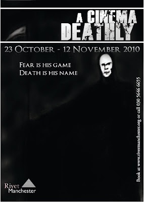
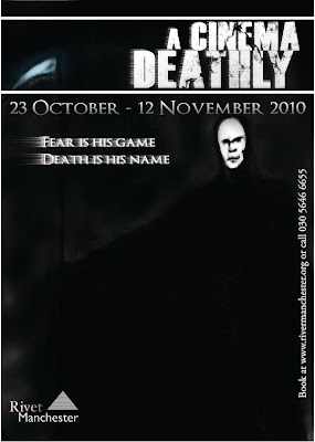
Here is the fifth and final poster. There are two versions which you can see. The posters are more-or-less the same with two slight differences. I duplicated the title and the slogan and gave it a wind filter which gives the illusion of drags to one side of the text. Or as if it has been blown out. The changes don't make any difference to the way I feel about this poster. This is the one I'm unhappy with at the final result. This piece lacks in character and substance and I also didn't spend as much time on so you could even say it has been rushed. When you look at it, it flares up no emotion, it's a poor and boring piece that needed more time spent on it. The fact that the centrepiece of this one is death himself I feel does not fit in to the mystery and subtlety to the project. So in a way it's like cheating my own rules. With this project I wanted a strong sense of mystery and depth. Hence the slogans being small riddles. I felt this was the piece that just lacked the mystery, the depth, the unpredictability and the horror. The reaper isn't even well drawn. At least I can say the other posters are miles better and I'm completed satisified with.

Death background for poster 5 (of 5)


This is the charcoal drawing I least like and deem not as effective as the rest. It's less shocking and/or as stunning as some of the others. As you can clearly see; the main subject of this piece is the Grim Reaper himself and as a drawing it doesn't look bad but it's quite clear that it was lacking in something. There is less or no use of shadows or textures in this piece so in a way it looks almost plain in comparison to the rest. The face of the Reaper lacks in character. It lacks in facial structure and the gaunt look I tried to make for him. I lightened his face and the scythe to make them stand out from the almost black background as the whole scene was incredibly dark. Another thing which I could've made better was more emphasis on the background. It's almost cloudy but in full honesty it's boring and there is nothing going on in the whole image; not just the background. With a second try I feel as if I coul've drawn this piece a lot better. This happens to be the obly piece I'm not happy with.

Poster 4 (of 5)


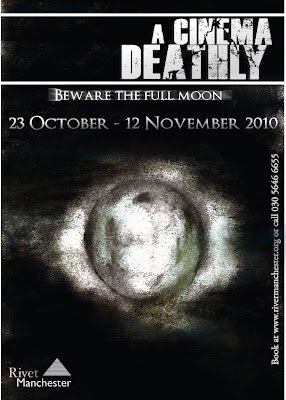
The first thing I came to edit with this piece was to darken the darker parts and lighten the lighter parts. In the original image it is clear that the drawing is too grey and lifeless. But with the edited, completed piece visible here there is an obvious almost luminous glow around the moon which I achieved using levels and the dodge tool. With the burn tool I created shadows and added deeper, darker trenches which border parts of the moon and with the dodge tool adding glow there are more characteristics and details to the mysterious sculpture. After these needed changes I placed in the new slogan but with this one I duplicated it and used motion blur to give the piece a ghostly echo behind.