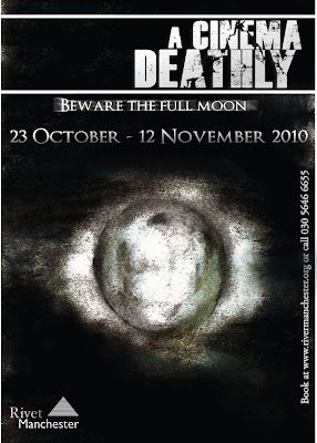
The first thing I came to edit with this piece was to darken the darker parts and lighten the lighter parts. In the original image it is clear that the drawing is too grey and lifeless. But with the edited, completed piece visible here there is an obvious almost luminous glow around the moon which I achieved using levels and the dodge tool. With the burn tool I created shadows and added deeper, darker trenches which border parts of the moon and with the dodge tool adding glow there are more characteristics and details to the mysterious sculpture. After these needed changes I placed in the new slogan but with this one I duplicated it and used motion blur to give the piece a ghostly echo behind.

No comments:
Post a Comment