Monday, 28 June 2010
Poster 5 (of 5) + alternate
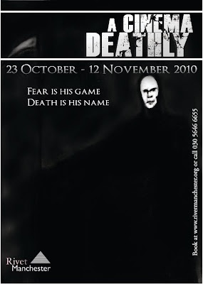
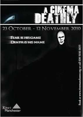
Here is the fifth and final poster. There are two versions which you can see. The posters are more-or-less the same with two slight differences. I duplicated the title and the slogan and gave it a wind filter which gives the illusion of drags to one side of the text. Or as if it has been blown out. The changes don't make any difference to the way I feel about this poster. This is the one I'm unhappy with at the final result. This piece lacks in character and substance and I also didn't spend as much time on so you could even say it has been rushed. When you look at it, it flares up no emotion, it's a poor and boring piece that needed more time spent on it. The fact that the centrepiece of this one is death himself I feel does not fit in to the mystery and subtlety to the project. So in a way it's like cheating my own rules. With this project I wanted a strong sense of mystery and depth. Hence the slogans being small riddles. I felt this was the piece that just lacked the mystery, the depth, the unpredictability and the horror. The reaper isn't even well drawn. At least I can say the other posters are miles better and I'm completed satisified with.
Death background for poster 5 (of 5)
This is the charcoal drawing I least like and deem not as effective as the rest. It's less shocking and/or as stunning as some of the others. As you can clearly see; the main subject of this piece is the Grim Reaper himself and as a drawing it doesn't look bad but it's quite clear that it was lacking in something. There is less or no use of shadows or textures in this piece so in a way it looks almost plain in comparison to the rest. The face of the Reaper lacks in character. It lacks in facial structure and the gaunt look I tried to make for him. I lightened his face and the scythe to make them stand out from the almost black background as the whole scene was incredibly dark. Another thing which I could've made better was more emphasis on the background. It's almost cloudy but in full honesty it's boring and there is nothing going on in the whole image; not just the background. With a second try I feel as if I coul've drawn this piece a lot better. This happens to be the obly piece I'm not happy with.
Poster 4 (of 5)
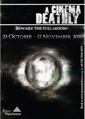
The first thing I came to edit with this piece was to darken the darker parts and lighten the lighter parts. In the original image it is clear that the drawing is too grey and lifeless. But with the edited, completed piece visible here there is an obvious almost luminous glow around the moon which I achieved using levels and the dodge tool. With the burn tool I created shadows and added deeper, darker trenches which border parts of the moon and with the dodge tool adding glow there are more characteristics and details to the mysterious sculpture. After these needed changes I placed in the new slogan but with this one I duplicated it and used motion blur to give the piece a ghostly echo behind.
Full moon background for poster 4 (of 5)
This is my single favourite charcoal drawing. I came up with the idea rotting from the forest and what could like in the forest. For example, werewolves. As soon as I came up with this idea; like a quick brainstorm I thought of a full moon idea. I tried to make a mist and a cloud element shrouding the clouds in the dark sky. This is visible but not on the scale I wanted it to. I would've liked more clouds and maybe even stars scattered across the page other than what I tried to do. But other than these missing pieces I put a mist which gives sort of an edge around the clouds which makes the moon stand out even more than what it already does. I wanted to make the moon look as genuine and well drawn as I possibly could. The only ways I could do this is to bring out the shape using highlighting, texture and shadows. Things which I feel have made my moon look (hopefully) stunning.
Monday, 21 June 2010
Poster 3 (of 5) + alternate
Here is the completed poster and an alternate to the completed poster. In this one you can see the chess piece with the same poster layout. In changing the charcoal chess piece I darkened the background and meddled with the levels to make certain parts lighter and others darker. The single difference between the two posters are clearly visible. The slogan in one of the posters (and the one I like more) is bolder and has a nice, radiant white glow behind it making it stand out from the page. The other is a less serious, distorted slogan with stretched, pulled and rotated distortions. It has more to it than the regular one but I think it is too much for the posters and strays away from the subtlety I am trying to achieve. With the alternate piece I'm talking about I was unsatisfied with it's Joker-like proportions so I created a plainer one which is bolder and has a glow which turned out better; but I have kept both. What I also did to change this poster to make it different from the rest of the posters which is also highly noticeable and stands out from the rest is that I distorted and re-edited the title. With the game element and the chess piece I come up with the distortion and re-proportion idea that would be suitable for the unique theme to this poster. In a way the title gives it an almost futuristic type of oddity.
Chess piece for poster 3 (of 5)
The chess piece is the only charcoal drawing that was in the original plans. The idea came to me when I considered the notion of 'playing with death'. With this idea of the chess piece I thought that instead of having the grim reaper or quite strong visuals with this chess piece it keeps the mystery and the game element. What I like about this charcoal drawing in particular is the contrast of the light and the shadows in the dark background. I think this is more effective than most of my other drawings becauase of the way it emphasizes on the mystery element to my project; not the horror.
Thursday, 17 June 2010
Poster 2 (of 5)
Here is the completed poster for 'the face of horror'. To complete this all I did was duplicate the 'Cinema Deathly' title, date and everything else. I added a new slogan to this one and after this I darkened the right side of the face and also the background and even lightened certain parts using the levels, burn and dodge tool. I cropped the face cutting out the shoulders and what was the upper part of the body. After adding on the new slogan I gave it an outer glow to make it stand out more, and it does look better with this glow. This is one of the few posters I'm almost completely satisfied with. I'd even go as far to say it is next to perfect (I don't consider anything perfect). I'm satisfied with this because it is exactly how I wanted it to be in the initial plans I did of the posters. In fact, I'd say the face I charcoaled is almost exactly how I described it in the plan beforehand and also how I pictured it in my head. I think (overall) the poster works well. Looking back at it there are one or two things which could be changed to make it even better but still I am happy with the work I have produced.
Wednesday, 16 June 2010
Background for Poster 2 (of 5) Face of Horror
The face background was actually my first background idea to create with charcoal. I wanted to have this crinkled, old, saggy eyed, ugly face filling the screen full of character but lacking in life. I wanted it to represent fear that much that it would give a feeling of coldness at a mere glimpse. What I thought would be more effective would be to have this face expressing fear and bleakness. Not a face full of wrath and hate. He's not evil. The face you see is not a villain. He is a victim. To create the face I used thick charcoal to create the deep shadows in the face and the blackness in the background and to create the eyes and the whole right side of the face. After outlining this and creating the shadows and skin tone and going deeper into the details I'd use a thinner piece to make the intricate details and to create the facial expression. I used a white chalk pencil to put glow and depth into the darker parts and to show the bony parts that needed to be visible in the shadows of the face and the darker side.
Monday, 14 June 2010
Poster 1 (of 5) First and Edited
Here is original and also the edited, completed version of my first poster. As I said about the drawing in an earlier post I added a lens flare and light beams shooting through the trees. As I said before I did not how to do this with charcoal but this edited version is actually as effective as I'd hoped. The lens flare works well behind the text, in the corner of the page. It gives hope to the dark, black and white image. Like, in this darkness and mystery there will always be hope. The glare I created does indeed give the image that extra element that I was looking for and hoping for. I then added other little edits to the piece such as putting a glow round the slogan to make it stand out more. Before all of these edits the poster looked plain and nowhere near as impressive. Even smaller scale things such as putting a bright outer glow to the slogan makes a world of difference to making a brilliant poster that will stand out. After these changesI had made; I am impressed with and proud of the finished piece.
Rivet Manchester logo
To advertise an exhibition there needs to be a gallery or a museum (obviously). I needed to know what would be needed to create such a logo by looking at museums and galleries logos such as Tate, Bluecoat, Bauhaus etc etc. So I wanted to make it simple but almost professional. So this I came up with 'Rivet Manchester'. It sounds real but also emotionless and almost characterless. It is subtle.
Background for Poster 1.
This is the first charcoal drawing I did. It is miles inferior to the majority of the other charcoal drawings but I like it, very much in fact. The idea came to me when my initial tagline was to tell people that they should come to this place where it takes you back to the past. I wanted an image that would set the scene straight away. A picture that would tell you where exactly I was heading with this. At a first glance on the computer and in my sketchbook it looks almost forgettable but what it represents and also the edited and complete version of this is effective and meaningful. I originally wanted to have light beams in the right hand corner of the image. I actually didn't really know how to portray this properly with charcoal so the edited version has a photoshopped lens flare which sums up what I was trying to do. The idea of a forest came to me when the mystery element and the darkness became to the most important element of the project and what exactly I wanted to give to the audience. That sense of mystery. A looming forest was perfect for that.
Dates, booking and why you should come to the show
Here you can see a date and a fictional website in the typeface 'OptimusPrinceps'. It is a font I dow loaded off the internet. AsI said in another post I very much wanted to create my own typeface but I could not create a typeface which was as suitable as a typeface like such for the project I was doing. I very much like this typeface, it's long, harrowing, it has an edge to it and it is the exact type suitable for such an old fashioned horror project. As you can see in the actual posters the date takes up a lot of the space on the posters. It's highly visible and it is important. If it is unknown why I created a date for my posters; I'm advertising an exhibition.
Monday, 7 June 2010
A Cinema Deathly title
I wanted to create my own typeface for this project and even made a couple of attempts at some classic handwritten suitable pieces but was proven inconclusive. It's not that I gave up that I used the typeface above for my campaign it just looked sot only suitable but it looked bold and strong enough to use and although it wasn't the classic handwritten typed that I initially hoped for; it turned out to look better after all of my research. It's modern, bold, it draws the eye in, it's well drawn and structured and it has worked very well in the course of the whole project. This is a reliable type. One of the reasons it works so well for me and my campaign is the fact that I wanted an edge to the type in the posters and I wanted something different. After using the gradient tool to give the text more character and depth and to stray it away from flat black I used a plain lasso tool to scribble an edgy crack in the strong text which looks almsot like a lighting strike and is effective in it's imperfection.
Friday, 4 June 2010
Taxonomy of the Apple iPhone
This poster is one of my favourite that I have researched. It is very good to look at and looks incredibly well put together. The way that this diagram has been placed together gives you an illusion of a complex, futuristic map of information. Like a New York subway map. This piece is not just a diagram representing how the Apple iPhone has been made what's involved in the making, it's a timeline. The diagram is very complex and excruciatingly informative.
Subscribe to:
Posts (Atom)