Friday, 2 July 2010
Poster on the Gate
To have my posters as apart of an urban surrounding uncaringly slapped onto an endless group and wall of posters advertising indie and metal bands and late night swinger parties is far more trashy, gritty and effective than just placing it on the window of a shop. It shows that what I'm getting out there is apart of modern society and the underground arts world. This poster is a start. It's lazily been glued to this old, dilapidated gate alongside warning signs and older posters. The printer was not working so I had to photoshop it on(unfortunately).
Unused Campaign 2: Peaceonwar.org (Poster)
I like using silhouettes in my work. With this poster and unused campaign I have red and black card to portray the aftermath of a war-zone battle (in Iraq possibly?) showing a proud war machine and fallen soldiers not as casualties but leftovers in the battle. As if they're not people but pawns in a game of death. As the masses of soldiers die as a group, a long list they matter and deserve sympathy in their mass amounts, their millions. But as individual dead soldiers, they're just scraps. A grim truth to what war represents, because of this the posters needed to be grim. Although I only got round to making one. I wanted to make the poster(s) simple but shocking. I wanted it to hit the viewer hard with the flat eyesore colours. Red and black squashed together is an eyesore but it's effective.
Unused Campaign 1: Centrestone Cult (Poster)
One thing I've always wanted to do and I still may do in the future is a project based on a fictional cult I create. But to have me as the prophet-like leader would be way to egocentric, as amusing as it would be for me. I've always had a secret interest in cults, cult-like groups and religions and also films based on cults such as 'The Wicker Man'. In fact I find them fascinating. Primitive, naive nature still lingering in the modern world, armies and factions being brainwashed and created for one purpose; to wreak havoc is something that wows me. This project gave me a chance to give this a very small attempt at this so I created this poster and planned a fictional campaign to try and get people to follow this cult I created. There was a certain theme I would've gone for if going through with this campaign. Old fashioned nature would require an old fashioned representation of my work. If you look at my poster it looks like it is straight from the 50's era. It has low saturation, big bold plain text, a black and white picture of Alec Guinness looking as slick as ever (and he fits the perfect image of a cult leader). In fact he almost reminds me of Elron Hubbard. The poster is clean cut and extra nice. Which is exactly how I wanted it. Too nice. It looks so nice that you know there's something not quite right; it has a sense of eeriness to it. It's bittersweet. Because who wouldn't trust a man with a halo around the back of his head? With this pre-campaign I have a list of crossed out names and motto's that would be plastered on my would-be posters. "We will give you everything you desire" sounded like the most questionable of the lot. If I did go through with this project I think it would've turned out well in the end. I also think I would've enjoyed it.
The Blurb (What the exhibition is about)
The idea for this is to give people an idea as to what the posters are about. Without a paragraph or a blurb like what I've written nobody will have the vaguest idea as to what the posters represent or what 'A Cinema Deathly' is. It could be mistaken for a film poster or even a ghost walk or something. With this piece people will know what 'A Cinema Deathly' is and will either draw them in or not interest them. It's clear and it's precise and it gives people a vision as to what I'm putting out there. My initial plan was to have this short paragraph placed on all of the posters but after trying this out it looked incredibly out of place and looked to big for the posters taking emphasis off the charcoal backgrounds I had drawn. And the posters just looked better in general with this piece uninvolved in the actual posters. So my next step (after printing off the completed posters and putting them on walls and taking pictures) is to print off my posters and the blurb as double-sided cards and fliers (or maybe even booklets?). It will stun the reader/viewer with the the viewer charcoal drawing/poster and on the other side it will have my blurb. Without this blurb my campaign is mistaken for a group of posters with no substance or meaning and cannot be proven as a campaign even. The blurb gives definition and reason to my campaign and is (in itself) proof of a campaign and can also give the reader pre-feelings before the exhibition/campaign.
Monday, 28 June 2010
Poster 5 (of 5) + alternate
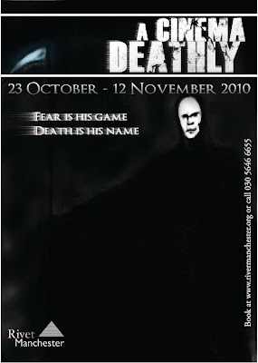
Here is the fifth and final poster. There are two versions which you can see. The posters are more-or-less the same with two slight differences. I duplicated the title and the slogan and gave it a wind filter which gives the illusion of drags to one side of the text. Or as if it has been blown out. The changes don't make any difference to the way I feel about this poster. This is the one I'm unhappy with at the final result. This piece lacks in character and substance and I also didn't spend as much time on so you could even say it has been rushed. When you look at it, it flares up no emotion, it's a poor and boring piece that needed more time spent on it. The fact that the centrepiece of this one is death himself I feel does not fit in to the mystery and subtlety to the project. So in a way it's like cheating my own rules. With this project I wanted a strong sense of mystery and depth. Hence the slogans being small riddles. I felt this was the piece that just lacked the mystery, the depth, the unpredictability and the horror. The reaper isn't even well drawn. At least I can say the other posters are miles better and I'm completed satisified with.
Death background for poster 5 (of 5)
This is the charcoal drawing I least like and deem not as effective as the rest. It's less shocking and/or as stunning as some of the others. As you can clearly see; the main subject of this piece is the Grim Reaper himself and as a drawing it doesn't look bad but it's quite clear that it was lacking in something. There is less or no use of shadows or textures in this piece so in a way it looks almost plain in comparison to the rest. The face of the Reaper lacks in character. It lacks in facial structure and the gaunt look I tried to make for him. I lightened his face and the scythe to make them stand out from the almost black background as the whole scene was incredibly dark. Another thing which I could've made better was more emphasis on the background. It's almost cloudy but in full honesty it's boring and there is nothing going on in the whole image; not just the background. With a second try I feel as if I coul've drawn this piece a lot better. This happens to be the obly piece I'm not happy with.
Poster 4 (of 5)
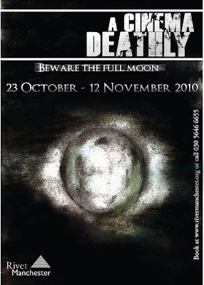
The first thing I came to edit with this piece was to darken the darker parts and lighten the lighter parts. In the original image it is clear that the drawing is too grey and lifeless. But with the edited, completed piece visible here there is an obvious almost luminous glow around the moon which I achieved using levels and the dodge tool. With the burn tool I created shadows and added deeper, darker trenches which border parts of the moon and with the dodge tool adding glow there are more characteristics and details to the mysterious sculpture. After these needed changes I placed in the new slogan but with this one I duplicated it and used motion blur to give the piece a ghostly echo behind.
Full moon background for poster 4 (of 5)
This is my single favourite charcoal drawing. I came up with the idea rotting from the forest and what could like in the forest. For example, werewolves. As soon as I came up with this idea; like a quick brainstorm I thought of a full moon idea. I tried to make a mist and a cloud element shrouding the clouds in the dark sky. This is visible but not on the scale I wanted it to. I would've liked more clouds and maybe even stars scattered across the page other than what I tried to do. But other than these missing pieces I put a mist which gives sort of an edge around the clouds which makes the moon stand out even more than what it already does. I wanted to make the moon look as genuine and well drawn as I possibly could. The only ways I could do this is to bring out the shape using highlighting, texture and shadows. Things which I feel have made my moon look (hopefully) stunning.
Monday, 21 June 2010
Poster 3 (of 5) + alternate
Here is the completed poster and an alternate to the completed poster. In this one you can see the chess piece with the same poster layout. In changing the charcoal chess piece I darkened the background and meddled with the levels to make certain parts lighter and others darker. The single difference between the two posters are clearly visible. The slogan in one of the posters (and the one I like more) is bolder and has a nice, radiant white glow behind it making it stand out from the page. The other is a less serious, distorted slogan with stretched, pulled and rotated distortions. It has more to it than the regular one but I think it is too much for the posters and strays away from the subtlety I am trying to achieve. With the alternate piece I'm talking about I was unsatisfied with it's Joker-like proportions so I created a plainer one which is bolder and has a glow which turned out better; but I have kept both. What I also did to change this poster to make it different from the rest of the posters which is also highly noticeable and stands out from the rest is that I distorted and re-edited the title. With the game element and the chess piece I come up with the distortion and re-proportion idea that would be suitable for the unique theme to this poster. In a way the title gives it an almost futuristic type of oddity.
Chess piece for poster 3 (of 5)
The chess piece is the only charcoal drawing that was in the original plans. The idea came to me when I considered the notion of 'playing with death'. With this idea of the chess piece I thought that instead of having the grim reaper or quite strong visuals with this chess piece it keeps the mystery and the game element. What I like about this charcoal drawing in particular is the contrast of the light and the shadows in the dark background. I think this is more effective than most of my other drawings becauase of the way it emphasizes on the mystery element to my project; not the horror.
Thursday, 17 June 2010
Poster 2 (of 5)
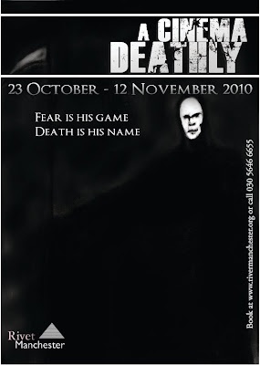
Here is the completed poster for 'the face of horror'. To complete this all I did was duplicate the 'Cinema Deathly' title, date and everything else. I added a new slogan to this one and after this I darkened the right side of the face and also the background and even lightened certain parts using the levels, burn and dodge tool. I cropped the face cutting out the shoulders and what was the upper part of the body. After adding on the new slogan I gave it an outer glow to make it stand out more, and it does look better with this glow. This is one of the few posters I'm almost completely satisfied with. I'd even go as far to say it is next to perfect (I don't consider anything perfect). I'm satisfied with this because it is exactly how I wanted it to be in the initial plans I did of the posters. In fact, I'd say the face I charcoaled is almost exactly how I described it in the plan beforehand and also how I pictured it in my head. I think (overall) the poster works well. Looking back at it there are one or two things which could be changed to make it even better but still I am happy with the work I have produced.
Wednesday, 16 June 2010
Background for Poster 2 (of 5) Face of Horror
The face background was actually my first background idea to create with charcoal. I wanted to have this crinkled, old, saggy eyed, ugly face filling the screen full of character but lacking in life. I wanted it to represent fear that much that it would give a feeling of coldness at a mere glimpse. What I thought would be more effective would be to have this face expressing fear and bleakness. Not a face full of wrath and hate. He's not evil. The face you see is not a villain. He is a victim. To create the face I used thick charcoal to create the deep shadows in the face and the blackness in the background and to create the eyes and the whole right side of the face. After outlining this and creating the shadows and skin tone and going deeper into the details I'd use a thinner piece to make the intricate details and to create the facial expression. I used a white chalk pencil to put glow and depth into the darker parts and to show the bony parts that needed to be visible in the shadows of the face and the darker side.
Monday, 14 June 2010
Poster 1 (of 5) First and Edited
Here is original and also the edited, completed version of my first poster. As I said about the drawing in an earlier post I added a lens flare and light beams shooting through the trees. As I said before I did not how to do this with charcoal but this edited version is actually as effective as I'd hoped. The lens flare works well behind the text, in the corner of the page. It gives hope to the dark, black and white image. Like, in this darkness and mystery there will always be hope. The glare I created does indeed give the image that extra element that I was looking for and hoping for. I then added other little edits to the piece such as putting a glow round the slogan to make it stand out more. Before all of these edits the poster looked plain and nowhere near as impressive. Even smaller scale things such as putting a bright outer glow to the slogan makes a world of difference to making a brilliant poster that will stand out. After these changesI had made; I am impressed with and proud of the finished piece.
Rivet Manchester logo
To advertise an exhibition there needs to be a gallery or a museum (obviously). I needed to know what would be needed to create such a logo by looking at museums and galleries logos such as Tate, Bluecoat, Bauhaus etc etc. So I wanted to make it simple but almost professional. So this I came up with 'Rivet Manchester'. It sounds real but also emotionless and almost characterless. It is subtle.
Background for Poster 1.
This is the first charcoal drawing I did. It is miles inferior to the majority of the other charcoal drawings but I like it, very much in fact. The idea came to me when my initial tagline was to tell people that they should come to this place where it takes you back to the past. I wanted an image that would set the scene straight away. A picture that would tell you where exactly I was heading with this. At a first glance on the computer and in my sketchbook it looks almost forgettable but what it represents and also the edited and complete version of this is effective and meaningful. I originally wanted to have light beams in the right hand corner of the image. I actually didn't really know how to portray this properly with charcoal so the edited version has a photoshopped lens flare which sums up what I was trying to do. The idea of a forest came to me when the mystery element and the darkness became to the most important element of the project and what exactly I wanted to give to the audience. That sense of mystery. A looming forest was perfect for that.
Dates, booking and why you should come to the show
Here you can see a date and a fictional website in the typeface 'OptimusPrinceps'. It is a font I dow loaded off the internet. AsI said in another post I very much wanted to create my own typeface but I could not create a typeface which was as suitable as a typeface like such for the project I was doing. I very much like this typeface, it's long, harrowing, it has an edge to it and it is the exact type suitable for such an old fashioned horror project. As you can see in the actual posters the date takes up a lot of the space on the posters. It's highly visible and it is important. If it is unknown why I created a date for my posters; I'm advertising an exhibition.
Monday, 7 June 2010
A Cinema Deathly title
I wanted to create my own typeface for this project and even made a couple of attempts at some classic handwritten suitable pieces but was proven inconclusive. It's not that I gave up that I used the typeface above for my campaign it just looked sot only suitable but it looked bold and strong enough to use and although it wasn't the classic handwritten typed that I initially hoped for; it turned out to look better after all of my research. It's modern, bold, it draws the eye in, it's well drawn and structured and it has worked very well in the course of the whole project. This is a reliable type. One of the reasons it works so well for me and my campaign is the fact that I wanted an edge to the type in the posters and I wanted something different. After using the gradient tool to give the text more character and depth and to stray it away from flat black I used a plain lasso tool to scribble an edgy crack in the strong text which looks almsot like a lighting strike and is effective in it's imperfection.
Friday, 4 June 2010
Taxonomy of the Apple iPhone
This poster is one of my favourite that I have researched. It is very good to look at and looks incredibly well put together. The way that this diagram has been placed together gives you an illusion of a complex, futuristic map of information. Like a New York subway map. This piece is not just a diagram representing how the Apple iPhone has been made what's involved in the making, it's a timeline. The diagram is very complex and excruciatingly informative.
Tuesday, 25 May 2010
The Feltron Report
The Feltron Report is a piece of statistical information that logs how many hours Nicholas Feltron played on Grand Theft Auto 4. The way the statistics are layed out in the piece make the figures bold and clear. The piece of graphics itself looks very interesting and is good to look at and at a glance it looks well put together but it's also messy and hard to follow because the statistics and figures stand out so boldly but the information next to the figures are miniscule. The top piece which is clearly the GTA4 map cut up and made into an information map looks visually impressive because of the creative way it has been cut up and re-placed together like a jigsaw.
Drugs World
In this piece there is a lot of information and it seems to just jump out at you. This poster is a sort of threshold diagram showing the many different types of drugs and how they are linked together. The diagram is cut into four parts: Stimulants, Depressants, Antipsychotics and Hallucogens. One word to describe this piece is informative. The way it has been made is that a lot of information has been fitted in and although at a first glance it looks random it is very well put together and there is a purpose and a scheme to it.
World Map of Touristyness
This is a map that represents how different parts of the world can have a substantial difference in tourism than other parts. The way this information is displayed is very interesting. There's almost no writing whatsoever and all of the information is displayed in a world map displaying the information and the differences using a 'hot and cold' area method. the way it is displayed is subtle and easy to understand and is intreaguing to look at.
Monday, 24 May 2010
Grind Coffee Packaging
The packaging for these coffees I thin are very well presented. The boxes blend together and stand in a line to create neatly, subtle cut colour scheme. The richness of the colours and the combination of the column of key words describing how unique, rich and flavourful the coffee is makes viewers of this product feel an urge to buy it. The packaging is effective for the product and the packaging serves it's purpose well.
Information Graphics
Information graphics or infographics are visual representations of information, data or knowledge. These graphics are used where complex information needs to be explained quickly and clearly, such as in signs, maps, journalism, technical writing, and education. They are also used extensively as tools by computer scientists, mathematicians, and statisticians to ease the process of developing and communicating conceptual information.
Monday, 10 May 2010
FourHourArtsShow Poster
Sign
The sign in the image is a poster for an Arts Show. It's presumably linked to Typography.
Signifier
The Signifier in this image is the dark red, scarlet even, bold horizontal text with the show title and date standing out in the middle of the poster. There is also grey/white typographic text behind the red text which in the way it is printed on; looks collage-like. And behind all of this text is a business newspaper.
Signified
The scale of the deep read Typography is ultimately eye-catching. The poster itself isn't anything special, it isn't amateur but it isn't brilliantly designed either. What is good about this poster though is the way the appealing red text stands out on top of the faded text and the business paper; it's dark, grungy and brooding and leaps out above the light background in this urban piece.
Bob Dylan "Together Through Life" Album Cover
Sign
Bob Dylan album cover.
Signifier
In this cover the signifier is the black and white image of the young man and woman, curled up and kissing in the back of a car. The letterforms, cracked and grungy but neat and bold in it's structure. Which is probably the result of a letterpress, handprinted in all it's quality. The colours are subtle and effective, darker red and navy.
Signified
The slogan "Together Through Life" hints at sum sort of subliminal meaning in the roadie image of the pair of young lovers. Maybe this is life? The best that it gets? To lounge in the back of a car getting cosy with your significant other. The image, black and white, blurring out the excess outside of the young couple; bringing them into focus as much as possible.
Iron Maiden Album Cover
Sign:
The sign is the Iron Maiden album cover 'A Matter of Life and Death'.
Signifier
The Signifier in this image is the treacherous, apocalyptic warzone depicted in the image. The cities burnt in the background are the aftermath of a powerful, destructive force that has set the cities ablaze through war. At the head of all this are 6 fearless soldiers protected by their rampaging war machine on their way back from the dilapidated city.
Signified:
The Signified in this poster is what is represented by all of this destruction and chaos and the meaning of the skeleton soldiers. The fact that these soldiers are skeletons may be an indication that they're already dead. Wether they're dead on the inside or they are dead. "A Matter of Life and Death" is the tagline. In destruction like is depicted then you have to lose all humanity to survive and have no sympathy, pity, remorse or empathy. These soldiers are still left standing because of this. They are heartless creatures and they are already dead... on the inside. Another theory would be that we are already in hell and all out chaos is inevitable.
World Typographic Poster
Sign The sign is the displayed Typographic world map.
Signifier The Signifier is the world map itself. Each country has typographic elemental names to the countries, very creative. The bigger the country the bigger the text crammed in to the country. The whole scale of this image is large and in perspective. The background to the map (or what would be the sea) has dark corners and a sort of distorted glass feel when zoomed in. But when zoomed out the background looks like a paper bag texture which combines the cream and black typographic countries to make a nice, clean cut and slightly dark colour scheme.
Signified The typographic world map is a portrayal of the fact that design has took the world by storm. Like an uncontrollable unstoppable force. In every country, in every state and province, every street and house there is design and there is Typography. From the small scale country of Turkey compared to the enormous giant named Russia.
Truman Show Poster
Sign
The sign is the Truman Show poster. The collection of miniature images to make different, a larger scale one.
Signifier
The Signifier in this post is quite complex. Carrey as Truman Burbank fills the poster in a brilliant close-up with the bright blue sky and the clouds behind him, looking up at the sky with a big enlightening smile on his face. Like a hero. At a first glance it just looks like a slightly pixelated image of Jim Carrey but after a closer examination you realise what is actually involved in the image. The poster, the image of Carrey is made up by hundreds of screenshots from the film itself. Varying from when the character of Truman was a child right up to his older years.
Signified
The image of Carrey in a god-like depiction represents his life. His eventful, happy life. Or maybe it represents life in general? The image could be quite moving to some people. To see all of these events in the characters life happening all at once to define life in all of its wonder and beauty makes a incredibly effective poster and you get the feel just by looking at this poster that it is going to be a deep film, a feel-good film and a moving film. And what's more is that we will see a whole life play out on screen, one scene at at time. Or in this case, on screenshot at a time.
Se7en Posters
Sign:
The Se7en movie poster left).
Signifier:
The signifier in this poster is the number '7' made out of snap shots from the film. The snapshots are low saturation in some, others have a sort of depressing and deathly nature. The tagline "Let he who is without sin try to survive" is also part of the signifier. Behind the '7' is a sickly orange/brown, grungy scratched out background which looks like an old, decaying wall.
Signified:
From the vibe these photos give off with the brutal nature and the low saturation it is indicated that the film itself is a dark, grungy and intense story. The masking tape over the sides of these photos gives then impression that the poster has been created by hand and as if the '7' has a deeper meaning to it and with the central characters and the victims of the killer in the story are the ones who make up the composition of the '7' you feel as if they're all connected and that they are apart of this meaningful number. The '7' is planted over the top of a grungy background where you can see the scratches in the walls and the dirt in the corners. It's as if the victims suffered in the making of the '7' and what's more is that they're the ones who make it which give the concept of the poster a whole deeper meaning.
Semiotics
What is Semiotics?
Semiotics is the science of communication and sign systems, in short, of the ways people understand phenomena and organize them mentally, and of the ways in which they devise means for transmitting that understanding and for sharing it with others. Although natural and artificial languages are therefore central to semiotics, its field covers all non-verbal signalling and extends to domains whose communicative dimension is perceived only unconsciously or subliminally. Knowledge, meaning, intention and action are thus fundamental concepts in the semiotic investigation of phenomena.
Signifier:
The signifier is the image itself, like a joke without the punch-line. It is what makes the sign and what attracts the audience of the viewer of the sign. Whilst the Signifier might seem like it has nothing in common with the signified, the two are connected and to have one you need the other. Although Signifiers (unlike signified) aren't confined to words it cannot not have self-representation because frankly it is just a word, an image, a meaningless form etc.
Signified:
The signified gives interpretation and even meaning to the signifier. If you have a Signifier on it's own it doesn't have any complex meaning or it's difficult or maybe even impossible to understand or interpret. For example, if you have a brutal image of a soldier fighting in Iraq, the Signifier would be the image of the soldier himself. It may be the thing that moves or even inspires the viewer but the Signified is what represents this image... In the image the Signified would be "The heroic, young, fearless leader fights for survival in the dilapidated hellhole. The difference between the Signifier and the Signified is that the Signifier never changes for anyone. The difference is that the Signified variates with different people because it is based on opinions, thoughts and emotions. With a certain image it will affect or move or shock or scare a lot of people in a lot of different ways because of the way that person interprets it.
Sign:
A sign is the result of the combination of the Signifier and the Signified. They call the relationship between the two 'Signification'. To make a sign you must have the both the Signifier and the Signified, the form and the concept combined for completion of a sign.
Tuesday, 27 April 2010
Greenpeace Advert
As far as Viral posters go this is one of the best examples of 'viral' advertising. It's an interesting advert and it's a strange one at that. It's interesting because it's so random and you have no idea who the advert is representing until the very end. One of the things that I noticed and found interesting in this was the music. It had a tone of sadness and bleakness in the air. As if you didn't want these flying saucers to depart...
I think it all fit together perfectly in the 30 seconds of this advertisement. The ending to the ad was a good ending because it ended on such a down note. The tagline "Have you ever wondered why they always go away?" a hint that we're living in a depressing, depraved place that no one wants to be apart of. This ad sticks out amongst a lot of others because of the bleak theme it has. It's effective in all it's sorrow.
Lika Gum
I think these are brilliant posters and are fascinating visually, and make you not want to look away. As great as these posters are however I really don't see how they'd relate to the gum. "Out of this World" is the tagline, the gum may be out of this world but I think the posters may be too dark, creepy, strange and photographic for a gum advert. Even the Lika Gum logo; green and blue splats are colourful and bold. Maybe it would have been more suited to a cartoon poster with like green aliens playing tennis with a piece of gum on Mars or something. Something less dark and more children and consumers can relate to. Other than that I do like these posters and they do look eerie... like they should be posters for horror films. Not bubblegum.
Expressionism Advert
I don't even know what this advert is for...
This is a short advert but all in all I think it's an effective one. What I think is highly noticable in this is the distortion of the backgrounds behind the pale, odd woman who keeps putting her head to the side and popping up out of nowhere. I think the backgrounds in this are pretty intreaguing in the simple patterns and bizarre structures which remind me of optical illusions and greek structures, art and architecture. I think the way the camera moves and the way it zooms in and out focusing on certain things and the quick flashing imagery is similar to the 'Metz' Judderman advert in all it's splendour and mystery. This advert is another example to modern expressionism and a duality of light and dark to create depth and character to the ad.
Fred and Barney advertising cigarettes
I love the irony of this advert. It's a perfect example of how society has changed and how things back then were accepted and considered OK and healthy and a good thing to do is nowadays considered stuipid, terrible and most of all is unaccepted as 'cool' in modern society. Back when this advert was made it used already popular characters, actors, films and TV shows to promote their product and get it on the mainstream market; in this it is The Flinstones.
Ahh Fred and Barney the two most likeable lazy-ass shit husbands in the world... One of the likeable things about this (I think) is how the two are portrayed and also accepted as lazy husbands who sit on their asses and smoke all day whilst they watch their exhausted wives run around after them and do all of the housework. Back then this was accepted as a modern american househhold and marriage and is portrayed as 'regular and normal' in this parodical smoking advert. If they made an advert with this type of marriage theme in this manner nowadays it probably wouldn't be comedic or portrayed as normal but instead it would be portrayed as the opposite... bad marriages and bad husbands because of how much times have changed and how women are accepted as equal in modern society. It just shows how likeable charcaters or TV shows, or whatever you want (because there are a lot of things that could be used) can in fact sway and pursuade you (or even brainwash you) into believing that you should do something, or act in a certain way, in this case it is spending money on cigarretes to be accepted and brainwashed into believing that it's the right thing to do!
You probably think I'm just rambling on about something incoherent and irrelevant to this advert but I'm not. What I'm trying to say is that comparing this to a modern smoking advert is just incredible, for example the kid's inhaling secondhand smoke advert . The themes and the way the product is promoted is on completely opposite sides! In this advert, the cigarretes are promoted as a good thing, a normal thing and also a more-or-less new and cool thing, and it was accepted. If you were young and walked round with a cigarrete back then (and I'm assuming this is in the 50's) you were considered cool. If your young now and walking round with a cigarrete in your mouth then you are considered a stuipid wanker who is voluntarily paying to suffer an early death and that you're a badly brought up, scruffy show off!
Smoking adverts these days are warnings, not promotions. Everyone knows how bad they are for your health. Most of us have a family member or know someone who has had some form of cancer which is linked to smoking. People pay a lot of money, well-earned and hard-worked money on something which is known as a fact to rot and destroy our insides and put us in an early grave. It's just a matter of time before it's made illegal. Society has changed and it's still changing...
The proof is above these paragraphs.
Subscribe to:
Posts (Atom)